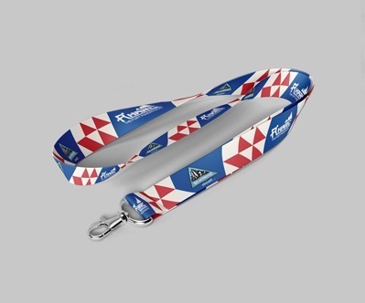
Marathon Accessory Design
I-card Design:For the Marathon Design Project, WDSOFT approached the I-Card design with a focus on incorporating the vibrant theme of the event. The I-Card design seamlessly integrated the three-tone color scheme from the sports logo, ensuring a cohesive visual identity.
It prominently featured images of the stunning landscapes, runners in action, and strategically placed sponsor logos to enhance the overall aesthetics and represent the dynamic nature of the adventure club.
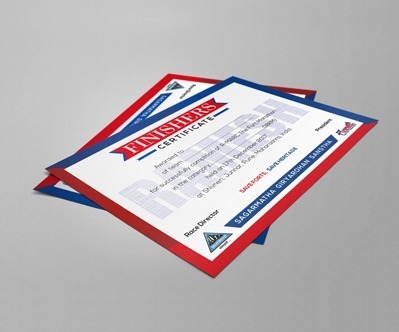
Certificate Design: WDSOFT brought creativity to the forefront in crafting the Certificate Design for the marathon. The design reflected the sense of accomplishment associated with completing the marathon and aligned with the organization’s objectives.
The certificate featured vivid graphics, mirroring the three-tone color palette and incorporating visual elements such as forts, runners, and sponsor logos, creating a visually appealing and personalized document of achievement.
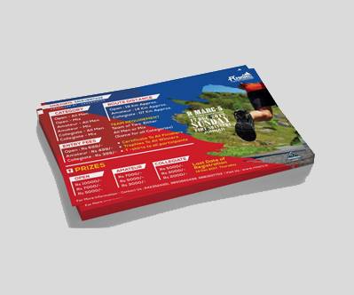
Flyer Design: The Flyer Design for the Marathon Design Project was a dynamic representation of the event's excitement. WDSOFT curated a visually striking flyer that effectively communicated essential information about the marathon while attracting the attention of the audience with graphics portraying the thrill of the adventure.
The use of the consistent three-tone color scheme tied the flyer seamlessly to the broader branding collateral, featuring images of sponsors, runners, and forts, reinforcing the event's adventurous spirit.
Stage Design: WDSOFT elevated the Marathon Branding for Fort Marathon by Sagarmatha through an innovative Stage Design. The design concept seamlessly blended the adventurous spirit of the event with aesthetic appeal, incorporating dynamic graphics and the distinctive three-tone color scheme. The stage became a visual focal point, captivating the audience and reinforcing the event's identity.
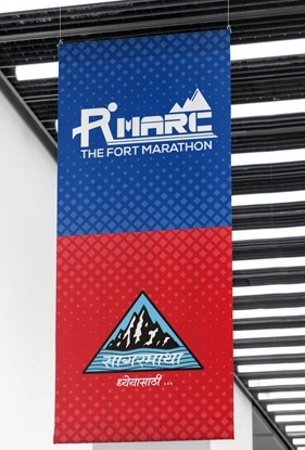
Wall Poster Design: WDSOFT brought creativity to the forefront with the Wall Poster Design, ensuring it became a standout element in the overall Marathon Branding. The posters were strategically adorned with vibrant graphics that mirrored the thrill of the Fort Marathon. The design not only effectively communicated essential details but also created a lasting visual impact, contributing to the overall success of the branding campaign.
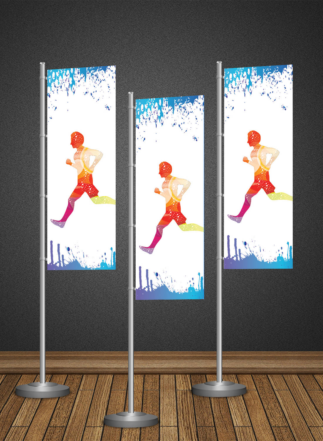
Standee Design: WDSOFT designed eye-catching Standees that played a crucial role in conveying the event's message to the audience. The Standee design featured energetic visuals of runners in action, scenic forts, and sponsor highlights. By maintaining thematic consistency with the overall branding collateral and utilizing the three-tone color scheme, the Standees became effective tools for both information dissemination and visual storytelling.
Print Media Ad Design: WDSOFT crafted compelling Print Media Ads that captured the essence of the Fort Marathon, ensuring a strong and distinct brand presence. The design strategically incorporated captivating visuals, including sponsor images, dynamic depictions of runners, and the iconic three-tone color palette. The print ads effectively communicated the excitement of the event, attracting participants and reinforcing the adventurous ethos of Sagarmatha's Fort Marathon.
WDSOFT's approach to the branding collateral design for the Marathon Project involved creating a cohesive visual language across all media collaterals. The graphics, aligned with the activities, maintained uniformity and utilized the same three-tone color scheme as the logo.
Through skillful integration of images featuring sponsors, runners, and forts, WDSOFT successfully delivered a comprehensive and visually engaging representation of the marathon event. The entire marathon branding project was a grand success. WDSOFT’s commitment and creativity was appreciated by the client.
About WDSOFT
At WDSOFT, we dominate the realm of Sports Branding with a focus on originality and impact. Our prowess lies in crafting distinctive brand identities that resonate with the spirit of sports. With a track record of success, we're not just designers; we're storytellers who articulate the essence of sports through compelling visual narratives. Choose WDSOFT for a branding experience that speaks the language of victory.


