Branding for an IT Company by WDSOFT
Branding for an IT Company by WDSOFT
Logo design for Securitium
Broucher Design For Data Science Company
Introduction
Securityium is a trusted brand which strives to ensure the robustness of your organization's IT security through comprehensive validation measures. The Services of Securitiyium are- Application Security Assessment, Infrastructure Security Assessment and Operational Security Assessment. The Company has experience working with many different types of organizations and applications - from start-ups to Fortune 500 companies.
The Challenge
The challenging task for WDSOFT Pune was a comprehensive rebranding effort, which included a logo redesign, as well as the development of new designs for brand guidelines, stationery, brochures, and cover pages. The challenge was to effectively gather all necessary content relevant to Securytium, organize it in a logical and coherent manner, and then infuse it with visually striking designs and photographs to create a logically structured, and aesthetically pleasing final product.
Our Response
WDSOFT Pune is a reputable brand-building agency that serves an array of prestigious clients across various industries. Our in-house team, comprising of experts with extensive experience in advertising, strategy, and communication, are well-versed in the nuances of branding. To gather all the necessary information for our projects, we conducted thorough meetings with the Securityium team, gathered all relevant data and photographs, and engaged in internal brainstorming sessions with our team to generate innovative ideas. This approach ensured that we delivered exceptional results that exceeded our client's expectations.
Logo Redesign
Logo design serves as the visual representation of the company's brand and identity. A well-designed logo creates a strong and positive impression and help to build trust and credibility. It has a greater recall value, and is a powerful marketing tool. WDSOFT Pune redesigned the logo of Securityium. It is Symbol+ Typography logo. It is designed using ‘s’ abstractly to show two connections passing through shield, which represents security. The blue connection denotes secure traffic and red connection show insecure traffic.
The fonts to be used with the logo are- Bebas Neue Regular, Manrope, Open Sans and more.
Brand Manual
WDSOFT crafted a thorough brand manual for Securitiyium that encompassed all aspects of the company's visual identity, including precise guidelines for logo usage and adherence to the company's overall brand standards. It consisted the fonts to be used with the logo, logo proportion, colour palette for highlight purpose, exclusion zone, co-branding, unacceptable zone and so on. The manual continues to serve as a valuable resource for ensuring consistent and effective communication of the Securitiyium brand.
Stationery Design
WDSOFT put forth dedicated efforts to create unique stationery for Securitiyium. All important elements, including the company's logo identity, were taken into account to ensure the final design was a perfect representation of the brand. The focus was on contemporary design and space optimization. The client was extremely pleased with the outcome.
Brochure Design
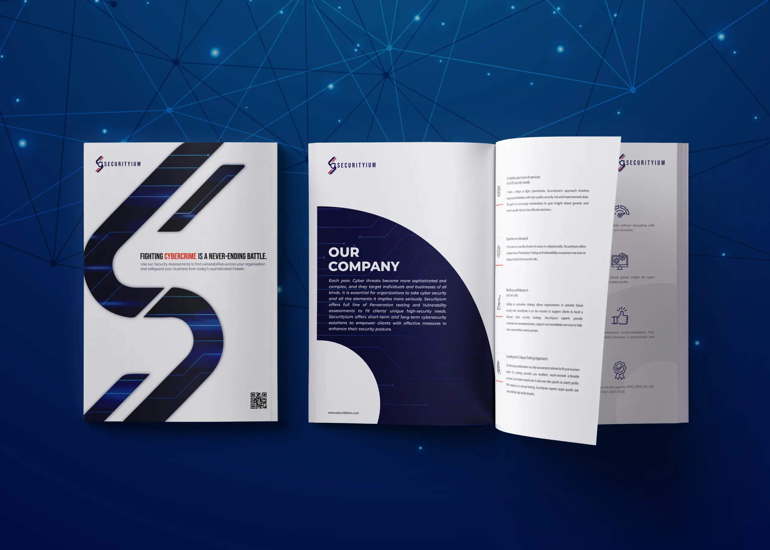
WDSOFT Pune created the brochure design with the goal of conveying the company vision and products in an effective and compelling manner. It was designed to capture the attention of the viewer, with an eye-catching cover featuring a cover caption and a minimalistic design. The inner text was crisp and informative, while the color palette was professional and appropriate to the company's brand. We carefully managed the layout and typography to create a visually pleasing and impactful brochure. Our team, with their expertise and experience, crafted the brochure with the highest visual quality and production value.
Cover Page Design
WDSOFT ensured that the cover page design of the brochure was in sync with the theme and layout of the brochure. We gave them three concept options to choose from. Each one was visually attractive and content-wise strong.
The Result
By executing a strategic 360-degree communication approach with careful planning, WDSOFT Pune successfully established Securityium as a premium brand through the creation of their logo, brochure, and stationery. Since partnering with us, Securityium has seen a significant boost in website traffic, resulting in greater visibility and brand recognition. Our designs for the logo, brochure, and website, as well as the content, were highly praised and effectively served the client's goals and reinforced their brand image.