Ghee Label & Packaging Design for Kalyatatva Organic Food Company in Pune, INDIA
Ghee Label & Packaging Design by WDSOFT


In the loaded world of consumer goods, where choices are abundant and attention spans are short, a good packaging and label design makes a long-lasting impact.
When it comes to products like ghee, a staple in many households, the packaging is not just a protective cover but a canvas that tells a story, communicates value, and captures the core of the product within. Ghee is a perishable item. This fact has to be considered while designing packaging and label.
WDSOFT is a reliable and professional Food branding agency in pune with expertise in Food packaging and label design. Team WDSOFT took a very comprehensive approach while designing packaging and labels for Kalyatatva Ghee.
Briefing, Research and Brainstorming
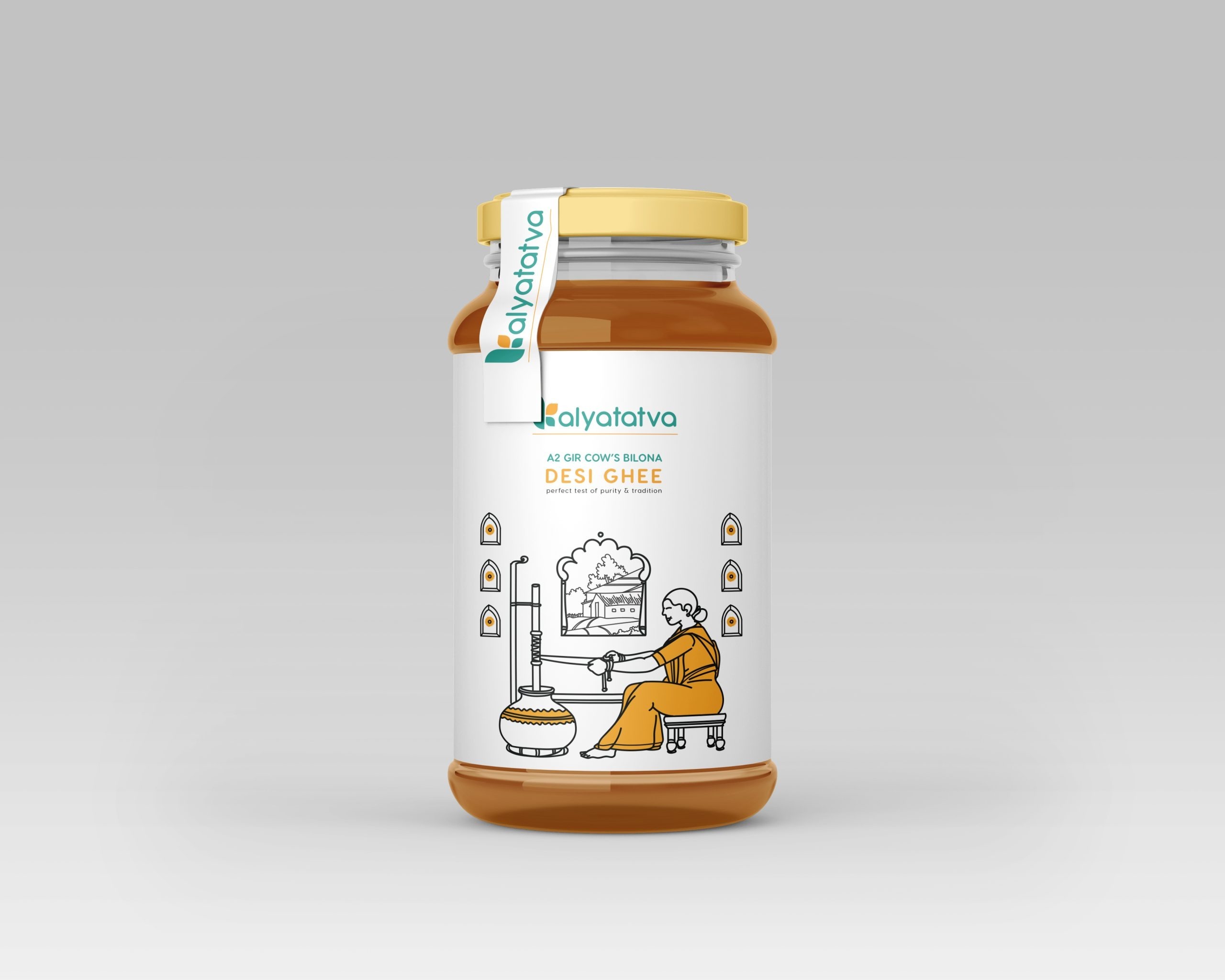
The Ghee Label & Packaging design journey began with thorough research. WDSOFT received a complete brief of Kalyatatva Ghee, understanding its journey, target audience, organic aspects of the food product, quality and the emotional connection it shared with its consumers. Recognizing the purity and tradition associated with ghee, our team aimed to showcase these attributes within the product label and packaging.
Distinctive Colour Palette
Attractive colour palette is the highlight of the Ghee packaging and label design. Rich hues of gold and deep earthy tones were chosen to symbolise the richness and authenticity of Kalyatatva Ghee. These colours are relevant to the premium quality.
Attention to Minute Detail
The Ghee Packaging and Label design is unique and innovative. Every detail, from the font selection, typography, and illustration to the placement of elements, is thoughtfully planned. The motifs and the graphic is in line with the nature and persona of the product, that is the ghee. Clear and concise information about the product is presented, ensuring that consumers could make informed choices.
Client Satisfaction and Appreciation
Upon presenting the design to the client, the WDSOFT team witnessed an immediate emotional connection. The client appreciated the thoughtful integration of tradition and innovation, the careful choice of colours, and the attention to detail.
The Ghee packaging and label design not only met the client’s expectations but surpassed them. It is in sync with the client’s vision for Kalyatatva Ghee, aligning perfectly with the brand's ethos.
Conclusion
In the competitive world of consumer goods, the success of a product often depends on its ability to stand out amidst the clutter. Good packaging and label design are aesthetic choices as well as strategic tools that communicate value, establish brand identity, and foster a strong bond with consumers.
Through their superior packaging and label creation for Kalyatatva Ghee, the WDSOFT team proved the power of design, elevating it beyond the shelves and into the hearts of the consumers. As the packaging adorns the product, it reflects tradition, purity, and innovation, making Kalyatatva Ghee not just a culinary delight but a cherished experience.