Logos Designed for Restaurants
Logo Design Challenge
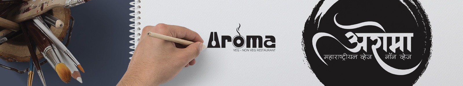
Aroma Maharastrian Veg and Non-Veg Hotel located in Shivajinagar Pune hired us as their logo design agency. Our designers contemplated on various aspects of the logo design. The name of the restaurant - AROMA - caught our logo designers' attention. Given the meaning of the word AROMA, it was decided to use this word in the logo.
Restaurant Logo Design Methodology
Our logo designers contemplated on the fact that the aroma reaches the nose before the food reaches the mouth and we can taste it. Smell helps to discover and enjoy food as much as taste. A distinctive, typically pleasant smell. One was to improve your appetite is through the aroma of food. These smells attract customers and stimulate particular sales. In-fact people are drawn towards good smell and are pushed to purchase the item based on its luring fragrance which represents deliciousness and freshness.
Colors for a Restaurant Logo
Having designed logos for scores of hotels and restaurants, we know that the RED color is no stranger to the food industry. Red color stimulates appetite, hunger and in food industry red also represents spicy taste. This color attracts the most attention and is associated with strong emotions such as love, luck and prosperity. Reds are used when you want to get pulses racing and to inspire action. Red is significance of fresh and in this case good food! The other color used is Green the color of growth and health. Think of nature and see green in all its glory expressing renewal and life. Green has a strong association as a refreshing and peaceful color. It evokes feeling of abundance and a plentiful environment while providing a restful and secure feeling. For good food, fresh and healthy are the terms that need to be taken into consideration. White is often associated with being pure, fresh and good, at its most complete and pure, the color of perfection. White objects fully reflect and scatter all the visible wavelengths of light.
Restaurant Logo Shape
The red shape of a cooking pot is the main point for the viewer to think and get attracted to Aroma , the scent of beautiful food! From the nutritional perspective to taste, pots are well-suited for all types of cooking. Even Ayurveda suggests cooking in clay pots, as it involves the slow cooking process that improves the quality and taste of food and also balances the nutrients.
Other Branding Collateral
As a reputed Brand Design and Development Company in Pune, we know that the logo is the chief brand ambassador of any business entity and a restaurant is no exception to it. We also designed the restaurant menu card with logo on it. The logo made its way on all the restaurant stationery like the menu card, signage, walls, tables, etc. WDsoft Pune's graphic design team also created an attractive font style for the restaurant.