Logo Design
All branding (or re-branding) activities begin with logo design (or re-design). The first task was to create a logo for the engineering company. It was decided to focus on the the "precision" nature of the engineering company. The main text of the logo "ATQ" is designed to have pointed edges to convey the precision character of the business. Again the main text features bright red color which is attractive and stands for energy and power.
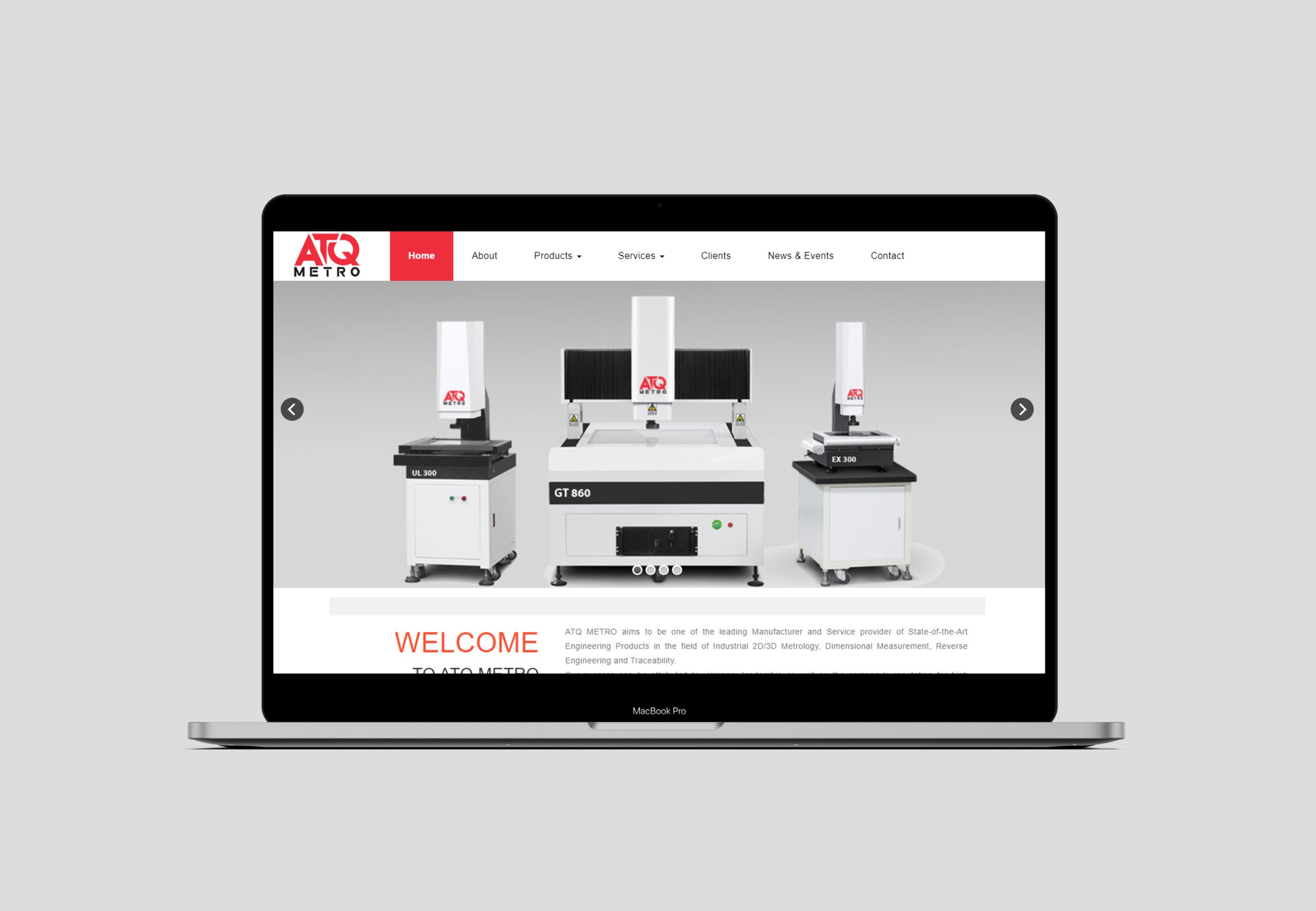
Website Design
WDsoft Pune's website development team created a content rich, SEO-ready responsive B2B website for ATQ Metro - www.atqmetro.com. We also created rich, corporate content for their company profile. ATQ Metro's website was going to be the main communication channel and special attention was paid to highlighting the USPs of the client. The infrastructure and the facilities are highlighted in website along with the products and services. After sales customer service being the key factor it was also highlighted.
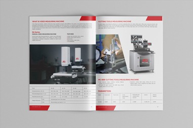
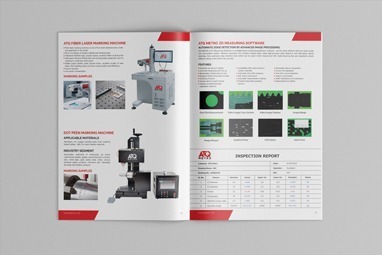
ATQ Metro has a wide product and service's range, and their products are large industrial measurement devices. To create confidence in the minds of their customers, we conducted a thorough photo shoot session for the metrology devices offered by ATQ. The high definition photo are clean, crisp, immaculate that do the talking. Product photo-shoot was conducted in the company's facility itself while the products were being used, this adds confidence in the brand image.
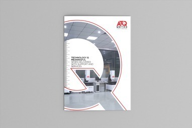
We made a prosperous graphical handouts and item indexes for wide scope of item classes. The pamphlets included a similar great pictures with moment subtleties and their specialized details and highlights. A handout is a blend of photographs, substance and determinations, keeping up the evenness of the considerable number of components on the pamphlet was a dubious errand however was very much cultivated.
At WDsoft Pune we understand the importance of exhibition and trade shows and know that they are ever more relevant in the digital age. Given the physical nature of exhibitions, they have a great impact on the target audience. ATQ Metro being from the B2B segment, exhibition and trade-shows branding strategy was finalized. We came up with a swanky stall design for the company's booth in the trade-shows. The desk panel featured the vibrant logo of the company, other panels featured the main products, slogan - "Just measure and trace it" along with the graphic depicting "precision" and the associated software.
Office Stationery and Branding Collateral
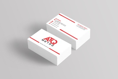
We also created rich, graphical flyers, business cards and other branding collateral with the same colour theme and consistency.


