Overview of the Cold-Pressed Oil Manufacturer
As a steadfast exponent of organic cold-pressed oil, HealthOrgOil is a manufacturer of pure, natural, and chemical-free groundnut, mustard, sesame, safflower, sunflower, and coconut cold-pressed oils in Pune. The client is aware that the path ahead is long, as there’s very little awareness in India about the health benefits of using cold-pressed oil. HealthOrg Oil faced several challenges in its brand transformation journey. Firstly, competing with big established brands posed a significant hurdle, as they had a stronger presence and market share. Secondly, redefining its brand identity required careful strategizing to differentiate from competitors while maintaining authenticity. To achieve this, HealthOrgOil hired WDsoft Pune, the best branding agency in Pune, for cold-pressed oil logo design, packaging and label design.
Branding and Digital Marketing Services Offered
We provided HealthOrgOil with a variety of branding services. These services included designing a logo, creating a brand identity, designing marketing materials, and making social media posts.
Logo Design
A logo serves as a symbolic depiction of an entire business entity, embodying its values and products. By visually connecting with the audience, it becomes the very identity of the business, leaving a lasting impression in their minds. Unlike mere words, a logo transcends boundaries and communicates effectively with a wider audience. As the best logo design company in Pune, we crafted a perfect logo for the Cold-Pressed Oil Manufacturer, crystallising the essence of their brand.
Logo Colors: The HealthOrgOil logo features two DARK colours: very dark desaturated orange [#643e31] and Very dark cyan [#14514B]. The dark orange colour signifies vitality and energy, while the cyan colour reflects purity and cleanliness—important aspects of the product or brand to consider.
Logo Elements: The cold-pressed oil logo design features three elements key to the product: a groundnut plant leaf, the oil bottle, and the cross-section of the coconut tree trunk. The logo has a fresh "green" leaf at its core, a cold-pressed oil bottle, a wood log that symbolises "Lakdi Ghana," and the coconut tree in the background. The brown colour reflects the "cold-pressed [wooden]" character of the product, which the audience can easily connect with.
Logo Design Principles
The essence of the HealthOrgOil brand is perfectly captured in its logo, which represents a commitment to natural, pure, and organic products. The logo features a depiction of cold-pressed oil, emphasising the brand's strong connection to nature and the promotion of a healthy lifestyle. Below the logo, the company name is elegantly displayed in a dark cyan font. Accompanying the logo is a meaningful tagline: "Let's make the world healthy," which encapsulates the brand's philosophy and dedication to its purpose.
The visuals and colour schemes of the cold-pressed oil logo design play a crucial role in various branding materials. Our skilled logo artists carefully selected the colours to ensure they resonated with the idea of a cold-pressed oil logo design. The same level of attention is given to the colours used for the different cold-pressed oil flavours offered by HealthOrgOil.
Brand Identity Design Principles
The branding and creation of the cold-pressed oil logo design incorporate a range of raw colour shades, including deep green, dark brown, turquoise blue, white, yellow ochre, and dark brown. The idea behind using these colours is to maintain consistency throughout the branding. The concept extends beyond the cold-pressed oil logo design, as the same colour scheme is applied to all branding accessories and marketing materials. Brand identity design goes beyond colours; it also emphasises the symmetrical placement of various elements. For instance, the wood cross-section is consistently positioned across all marketing collateral. WDSOFT Pune's graphic design team has developed a variety of collateral, such as brochure design, Cold-Pressed oil label design, product photography, visiting card design, letterhead design, envelope design, and brand website design, to complement the brand's identity.
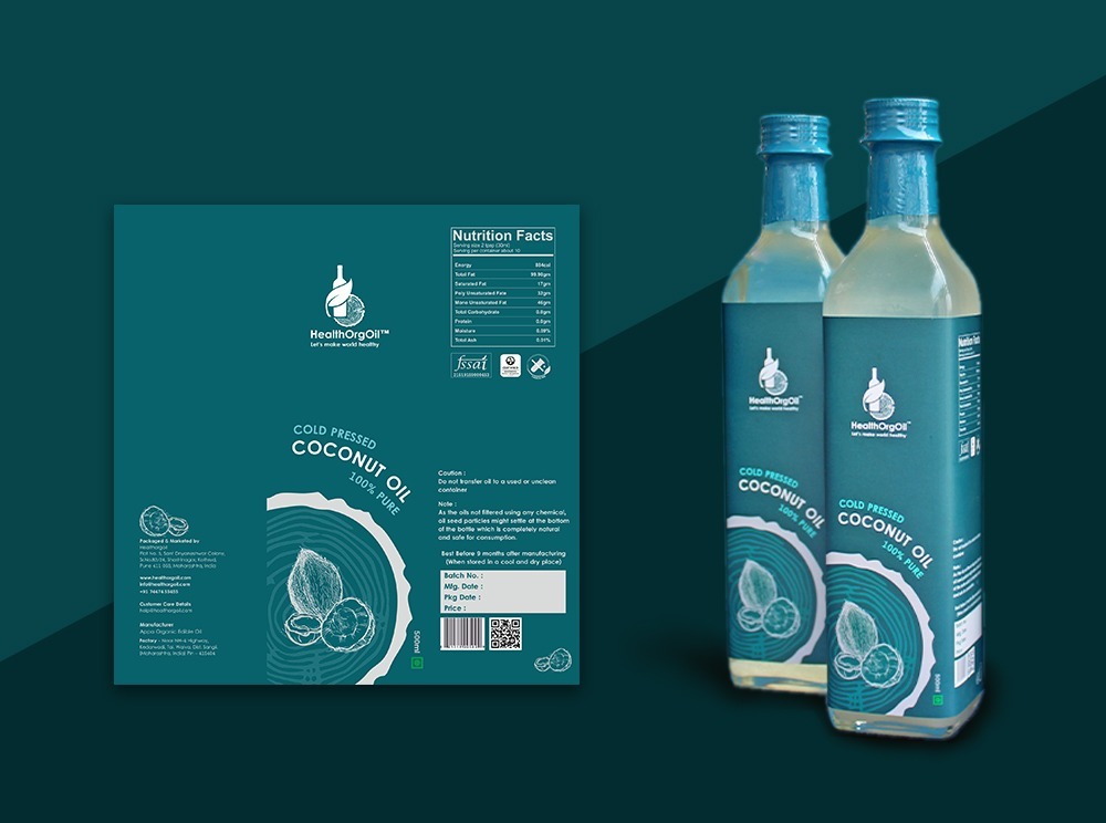
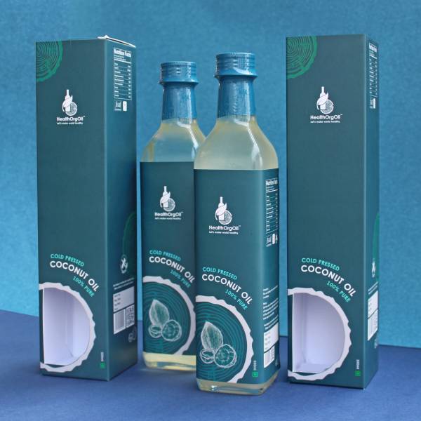
The coconut flavour has been represented by a subtle shade of blue, symbolising the calmness and refreshing nature commonly associated with coconuts and wood. This fruit is often consumed to stay cool and healthy during hot weather. Cold-pressed coconut oil offers numerous holistic benefits for people of all ages, complements various types of food, and is free from any harmful synthetic additives. The packaging portrays both coconut and groundnut oils effectively through graphics depicting their respective fruits and leaves. To enhance the visual appeal, the illustrators cleverly cut out a window on the box, revealing the inner label design and creating a captivating effect.
Marketing Collateral Design
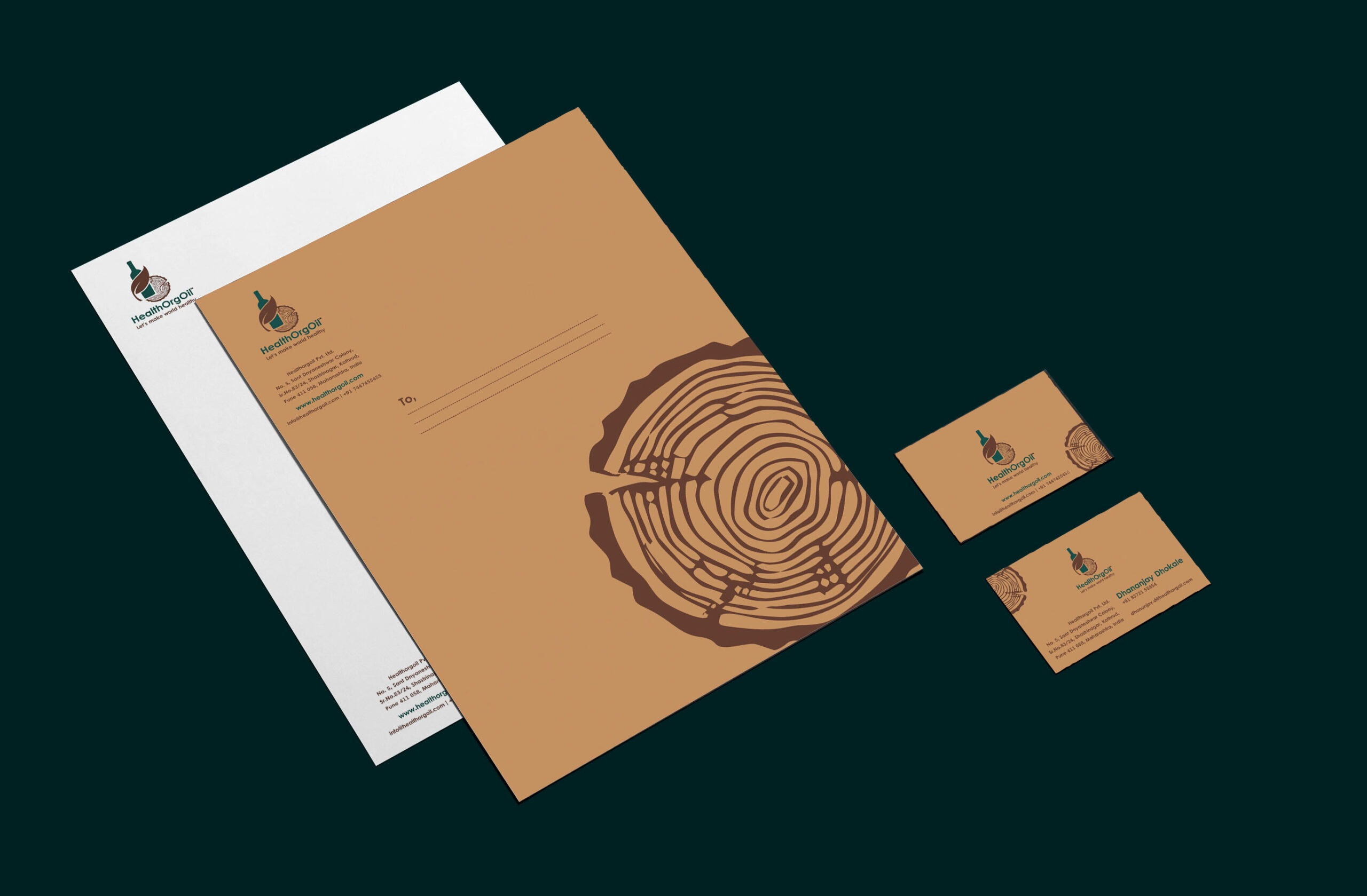
Visiting Card Design - The front side of the visiting card displays the cold-pressed oil logo design at the centre, which is adorned with a "slightly desaturated orange" shade, derived from the "Very dark desaturated orange [#643e31]" colour used in the logo. Furthermore, the card features a depiction of the "wood" cross-section in the bottom right corner. On the back side of the card, you'll notice a smaller cold-pressed oil logo design positioned at the centre, surrounded by prominently displayed business details.
Letterhead and Envelope Design - The letterhead showcases a clean white backdrop with the cold-pressed oil logo design positioned at the upper left corner, while essential contact information is located in the footer. As for the envelope design, it follows the same colour scheme as the visiting card.
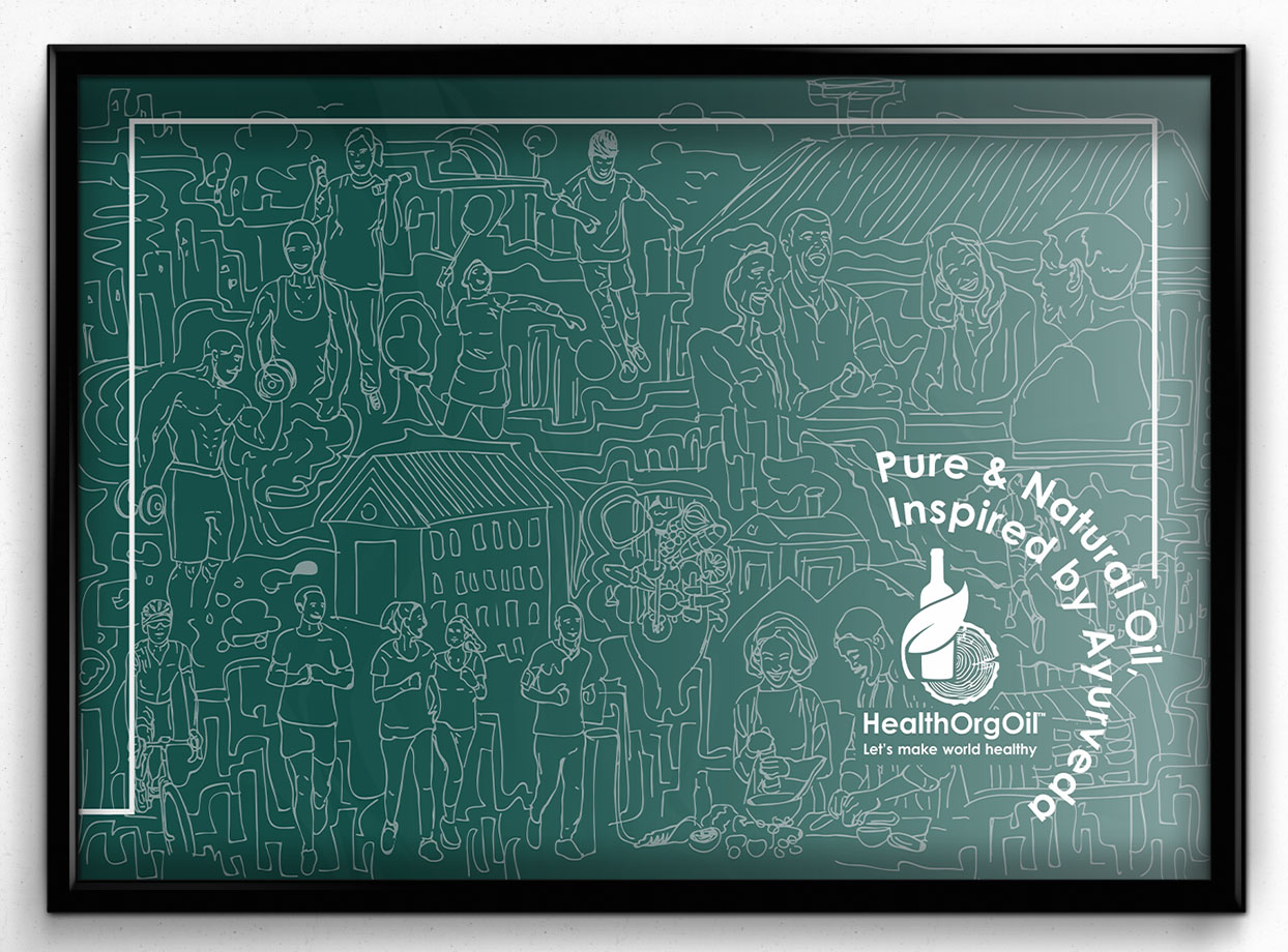
Brochure Design - The brochure represents the product and the company to the client and gives an elaborate understanding of them. The HealthOrgOil brochure cover has a calming and neutral grey colour in its branding. The cover showcases Illustration Art that highlights a range of exercises aimed at promoting a healthy lifestyle. Inside, the brochure provides comprehensive information about the product, including its details and the meticulous manufacturing process.
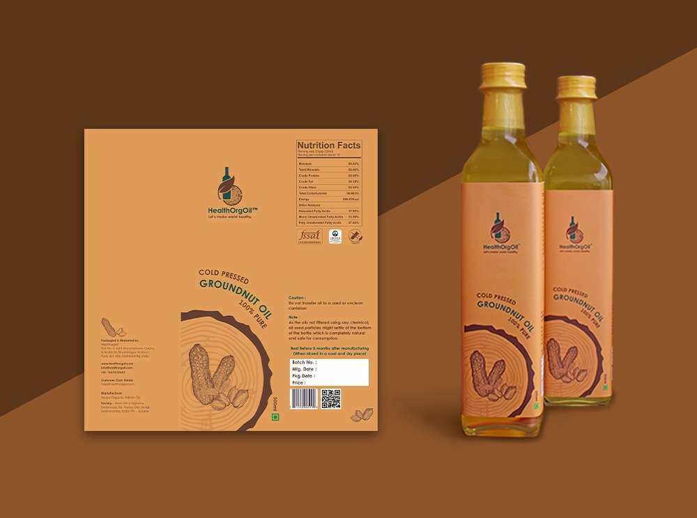
Product Label Design - We have created distinct cold-pressed oil label designs for two oil bottles: one for coconut oil and the other for groundnut oil. The coconut oil bottle label showcases a dark cyan colour with elements of deep green, while the groundnut oil bottle label features a dark brown shade, both inspired by our cold-pressed oil logo design. Each label contains standard content such as Nutrition Facts, dosage instructions, ingredients, price, barcode, QR code, batch number, and more. Additionally, the labels proudly display images of coconuts and groundnuts corresponding to the oil type. Furthermore, the cold-pressed oil label design includes consistent elements, such as the image of a cold-press oil machine and a wood cross-section, which are present on all the label designs.
Packaging Design
The packaging of the groundnut oil flavour features a new shade of dark brown [light brown shade]. The chosen colour closely resembles the light brown skin of a whole groundnut. This deliberate selection aims to establish a strong association between the cold-pressed oil logo design's colour and the actual flavour of groundnuts. Similar to coconut flavour, groundnut cold-press oil is also perfect for the entire family, suitable for preparing various cuisines, and entirely pure and unadulterated. Additionally, both varieties have a unique feature on their packaging: a cut section of the 'lakdi ghana' machine displayed at the back. It is incorporated to make known the process employed by HealthOrgOil. A brief write-up to depict the process is also included below the illustration. The oil bottles' packaging design perfectly matches the cold-pressed oil label design. For the coconut oil, the packaging showcases a delightful combination of turquoise, blue, and white colours, while the groundnut oil packaging presents an appealing blend of Yellow ochre and dark brown hues. The packaging's top fold prominently displays the logo for easy identification.
Product Photography -
The product photography for HealthOrgOil centres around capturing the essence of the raw ingredients, namely coconut and groundnut, and showcasing their versatile application in various food items. Our team conducted a comprehensive product shoot focusing on cold-pressed oil label design and capturing the essence of the product, producing stunning visuals that were incorporated into the brochure, social media posts, and website.
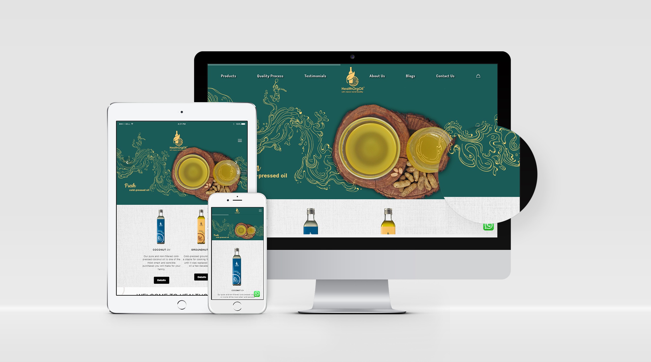
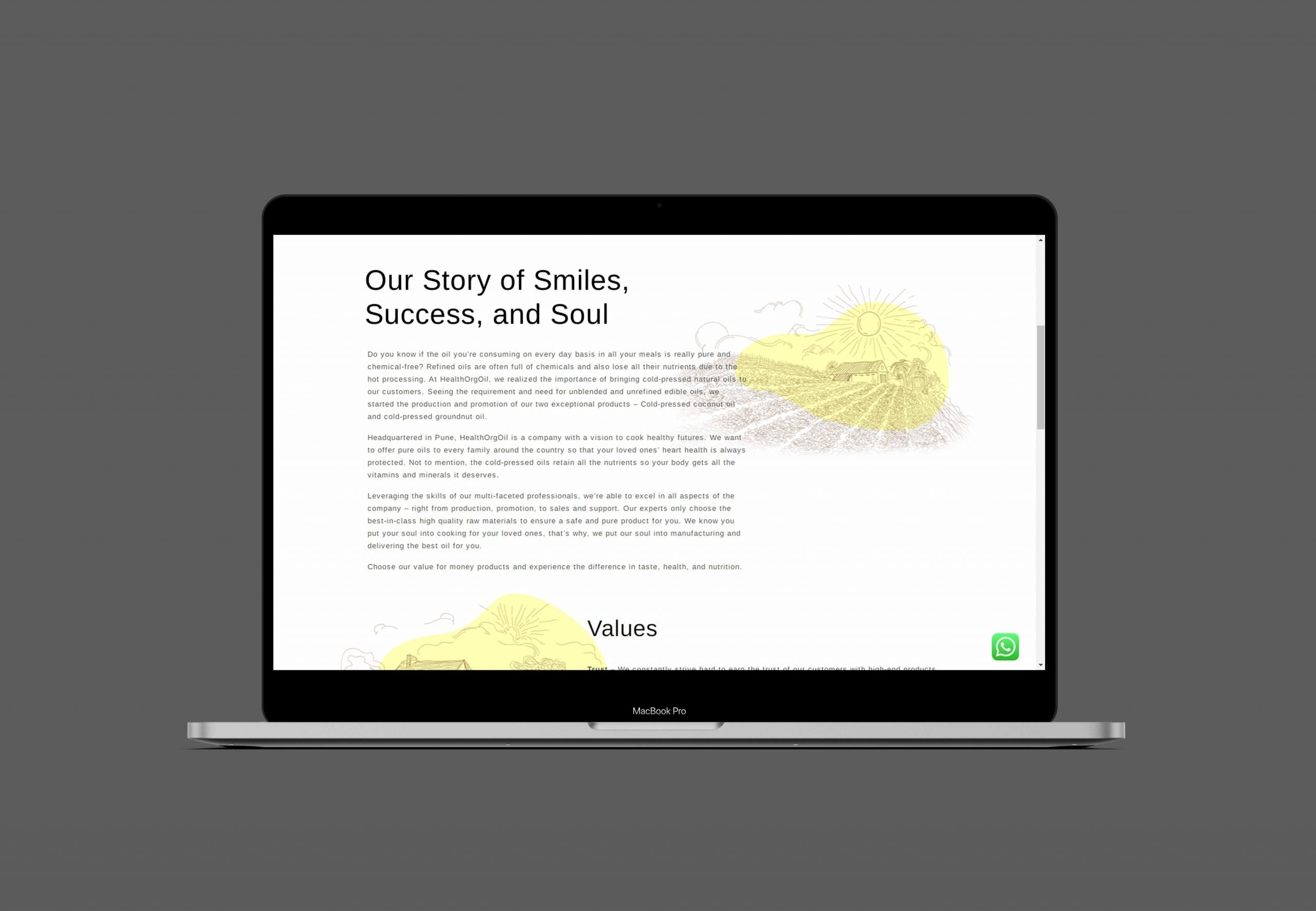
Website and Content - HealthOrgOil Pune's website has been completely revamped by our skilled website designers. To complement the design, our talented content writers have crafted engaging and informative content. We have also implemented a content marketing strategy, utilising well-written and targeted blog posts. Moreover, the website is optimised for SEO and aligned with HealthOrgOil's other branding materials.
Social Media Post Design - Our team of skilled graphic designers and content writers collaborated to produce mesmerising graphics tailored for various social media platforms. Within our comprehensive social media branding initiative, we executed both organic and paid campaigns on Facebook and Instagram. Our captivating social media posts comprise enticing visuals, impactful branding taglines, and enlightening content. These posts primarily highlighted the numerous advantages of our pressed-oil manufacturing process, the origin of our raw materials, and the meticulous sourcing methods we employ. Impressively, we successfully published more than 3,500 posts on Instagram, which contributed to a remarkable following of over 6530 dedicated followers on the platform.
Advertising Solutions
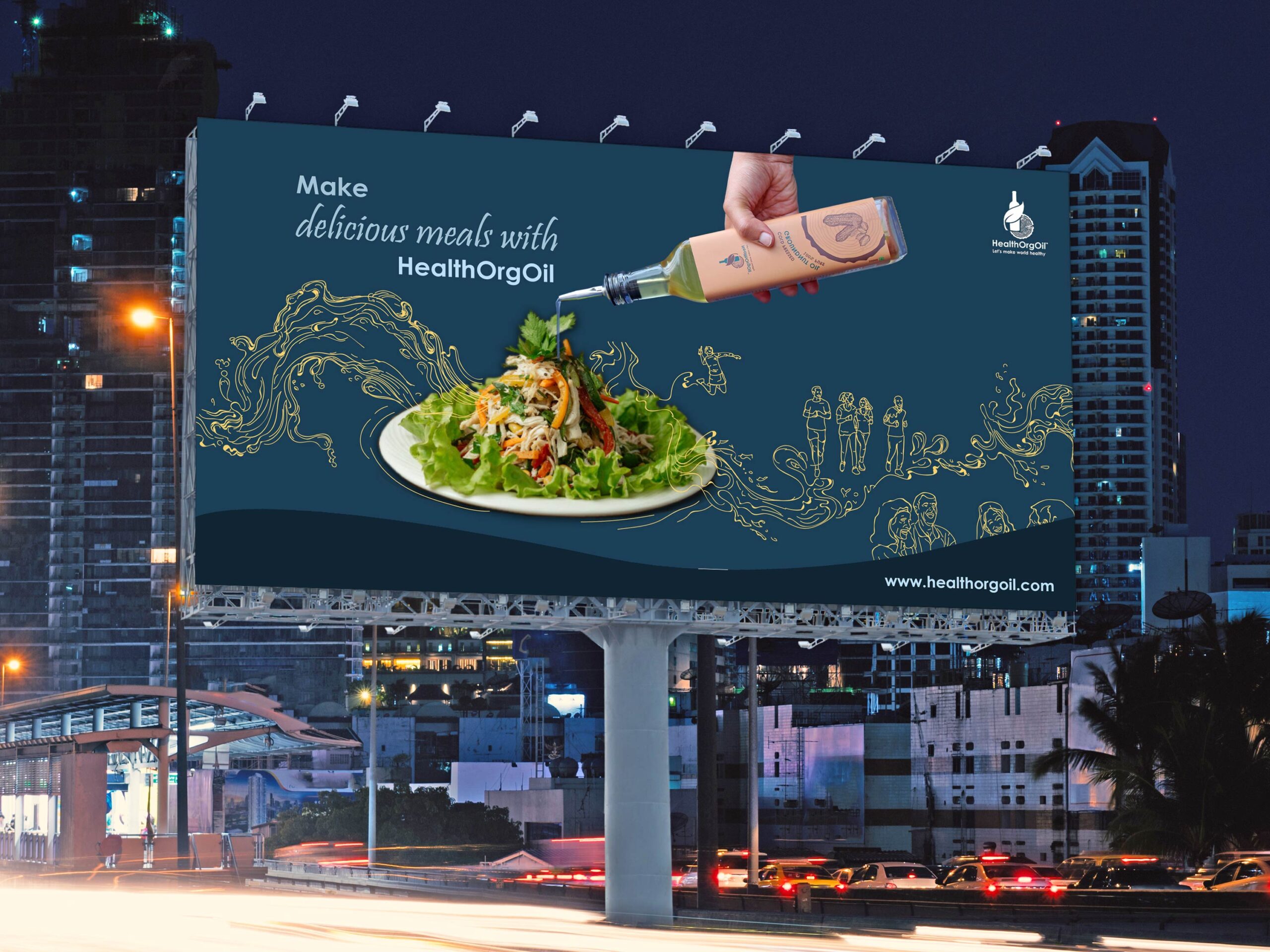
We have developed an abundance of imaginative advertising campaigns for the Cold-pressed Oil Manufacturer, encompassing various platforms such as social media ads and outdoor displays like hoardings and flex banners.
Conclusion
HealthOrgOil has accurately captured the essence of its two varieties of cold-pressed oil. The quality is entirely natural, pure, and nourishing, and this is beautifully showcased in its presentation. The cold-pressed oil logo design and carefully selected colours skillfully represent the high standard of their products. HealthOrgOil is committed to promoting awareness of the numerous health benefits associated with using cold-pressed oil and is determined to fulfil its mission of creating a healthier world.


