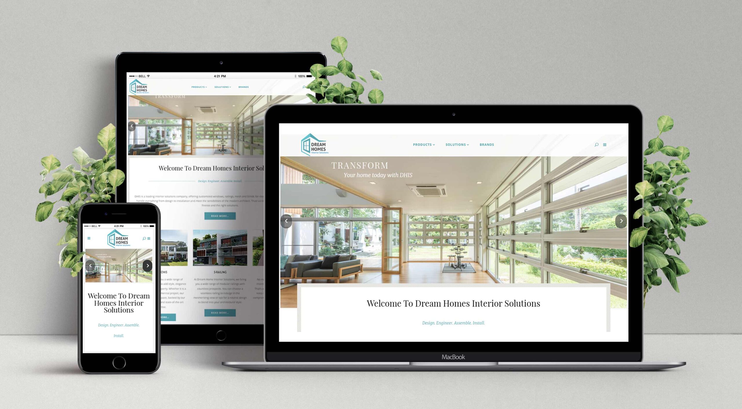
About Dream Homes Interior Solutions Pune
Dream Homes Interior Solutions Pune offers luxury home furnishing products. The interior design company carries quality products of various premium home furnishing brands like Finesta, Kohler etc. Dream Home Interior Solution's target audience include architects and home buyers with a flair for regal lifestyle. People who like to have customized interiors like oversize windows, shower enclosures, spacious living space etc. The product includes windows, doors, bathroom fittings, living-room interiors, home theaters etc. The idea behind this project was that exceptional designs and outstanding interiors are some of the factors that buyers seek while purchasing a luxury home. Spacious floor spaces and a good locality are few of the other elements which you prefer during the time of investment in a property. Pune, as we all know, is one of the most beautiful and popular cities in India, and so getting a home here is just like a dream for all. To provide the people all of this and more, the Dream Homes Interior Solutions Company started working towards the well being of the society and helping
them live a better life.
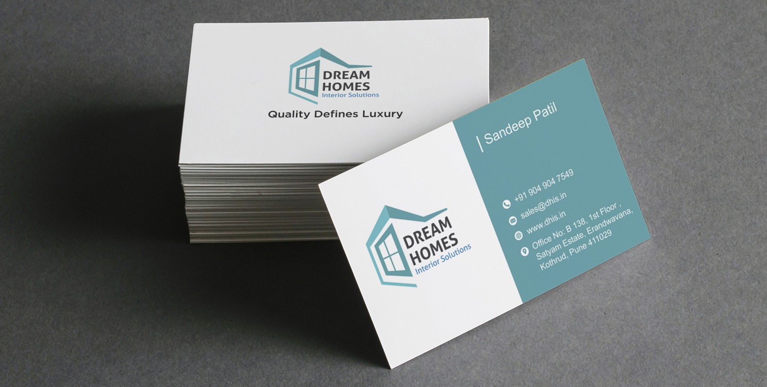
Branding slogan: "Quality defines Luxury"
Given the "luxury" character of the products offered by the interior design firm, our branding experts decided to craft a snappy branding slogan for the client. WDsoft's content writers crafted the slogan - "Quality defines Luxury". The slogan is short but packs a powerful branding punch. Combining the slogan with rich brochure content and graphics elevates the brand identity of the firm.
LOGO Design for the Interior Design Firm
Urban home buyers prefer wide windows like the French Windows particularly those who want to have their own bungalow. Oversize windows are Dream Home Interior Solutions' most sought-after product range and their principal product. So our logo designers at WDsoft Pune, decided to use the "WINDOW" as the main element of the logo. The LOGO has a 3D effect, it has a long wall running "deep" inside with an oversize window with the name "Dream Home Interior Solutions".
Logo Colors
Bluish Green - Dream homes being an interior solutions company that is associated with families and their spaces, decided to choose the colour blue blended with a hint of green. While Blue stands for trust and responsibility. This color is one of trust, responsibility, honesty and loyalty. It is sincere, reserved and quiet, and doesn't like to make a fuss or draw attention while green color signifies peace, growth, positive energy, nature, comfort, success and health. Such values create a sense of safety and satisfaction in the minds of the viewers.
Logo Shapes
A large portion of the occasions a shape is something other than a gathering of associated lines. The use of shapes could be essential or straightforward and show up inside pictures or as components inside a structure. The state of items in a given structure is utilized for passing on a message to the watchers which they aren't even deliberately mindful of! Squares and square shapes are the default shape for some pictures which is as it should be. This customary shape soaks up a feeling of balance and understanding. The recognizable shape is seen as steady and trusting. The square further identifies with the earth, with every one of the four corners giving the watcher a feeling of solace.
Logo Meaning
This logo is meant for the viewers to see a beautiful light coloured house sort of an image giving them an impression of a strong structure overseeing fabulous comfort and design which is a combination of innovative ideas and precise engineering. It speaks of how if one uses good quality, it is indirectly related to luxury and convenience as per the requirement of the client.
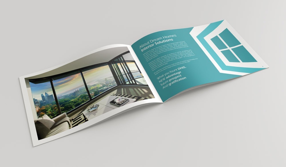
Brochure and Branding Collateral Design
We created a rectangular brochure with multiple sides that have to be flipped through which shows you luxurious spaces giving the viewer a taste of a sophisticated environment fit for the best. Our content writers created elegant content for the brochure. The interior design firm brochure is a perfect combination of text and images that walks the viewers through the range of products available with the company. The "uncluttered" visiting card is also completely white with the logo and information provided so it is easier to grasp the important details instead of choosing a very complex style of card. There is uniformity in the color scheme, typography and object placement on all the communication collateral.


